↳ Ton
Branding, Visual Identity, Art Direction, Tone of Voice
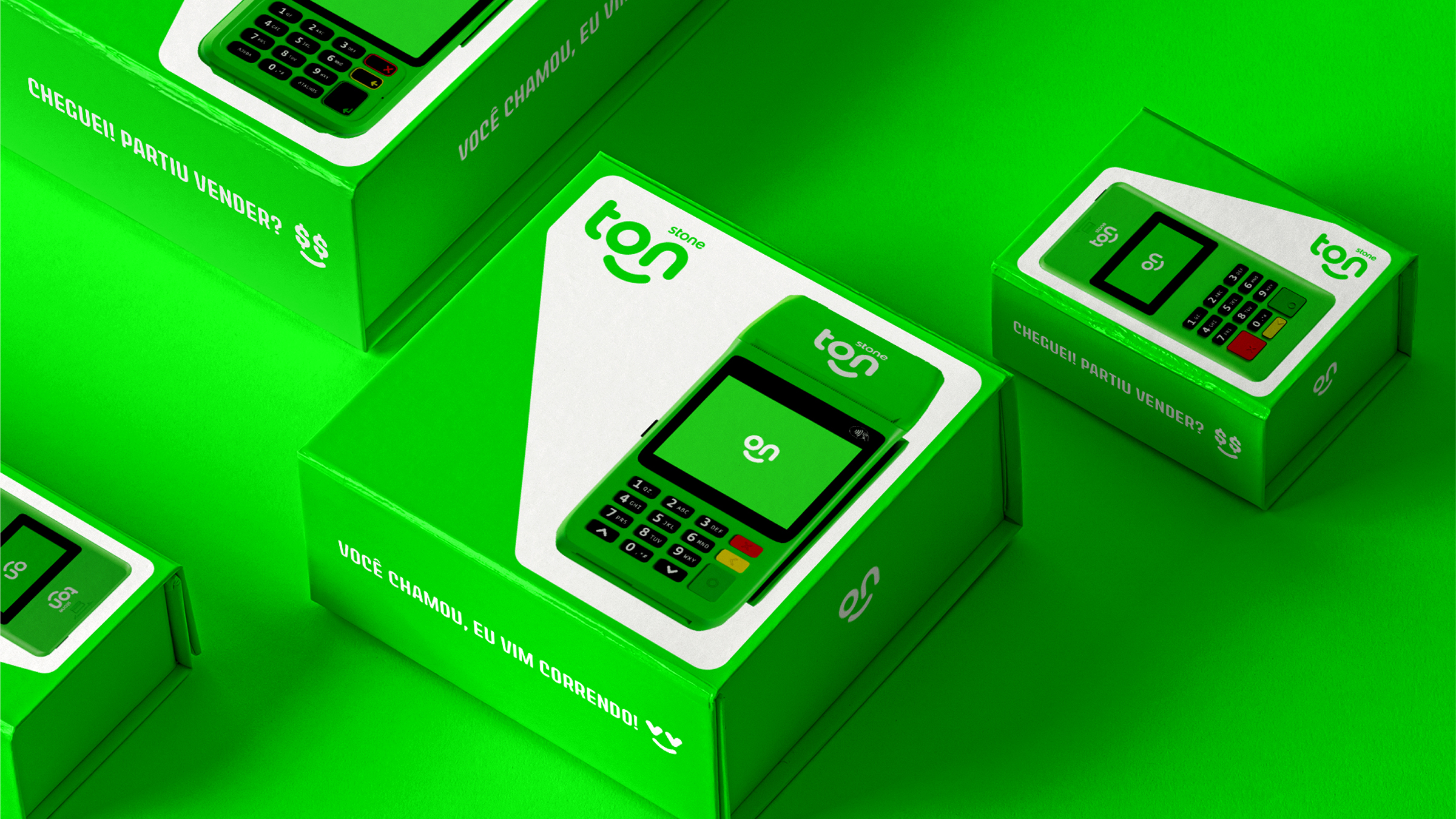
Created to help an extremely price-sensitive micro-entrepreneur audience, Ton didn't take long to consolidate itself in the category – After three years of its foundation, it had already evolved beyond its original identity! So, we made a major rebranding: positioning, visual identity, tone of voice, photography and motion guidelines.
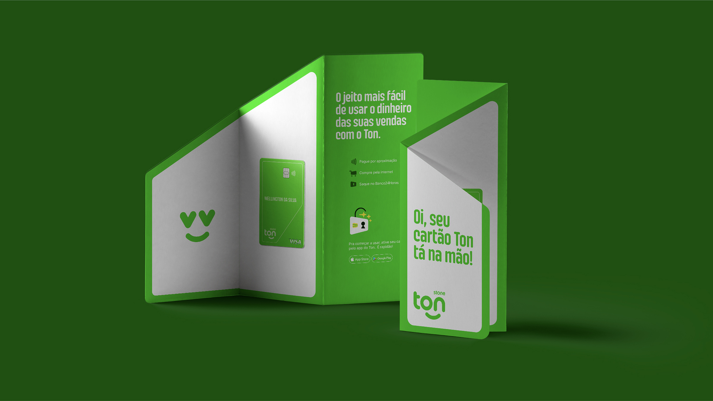
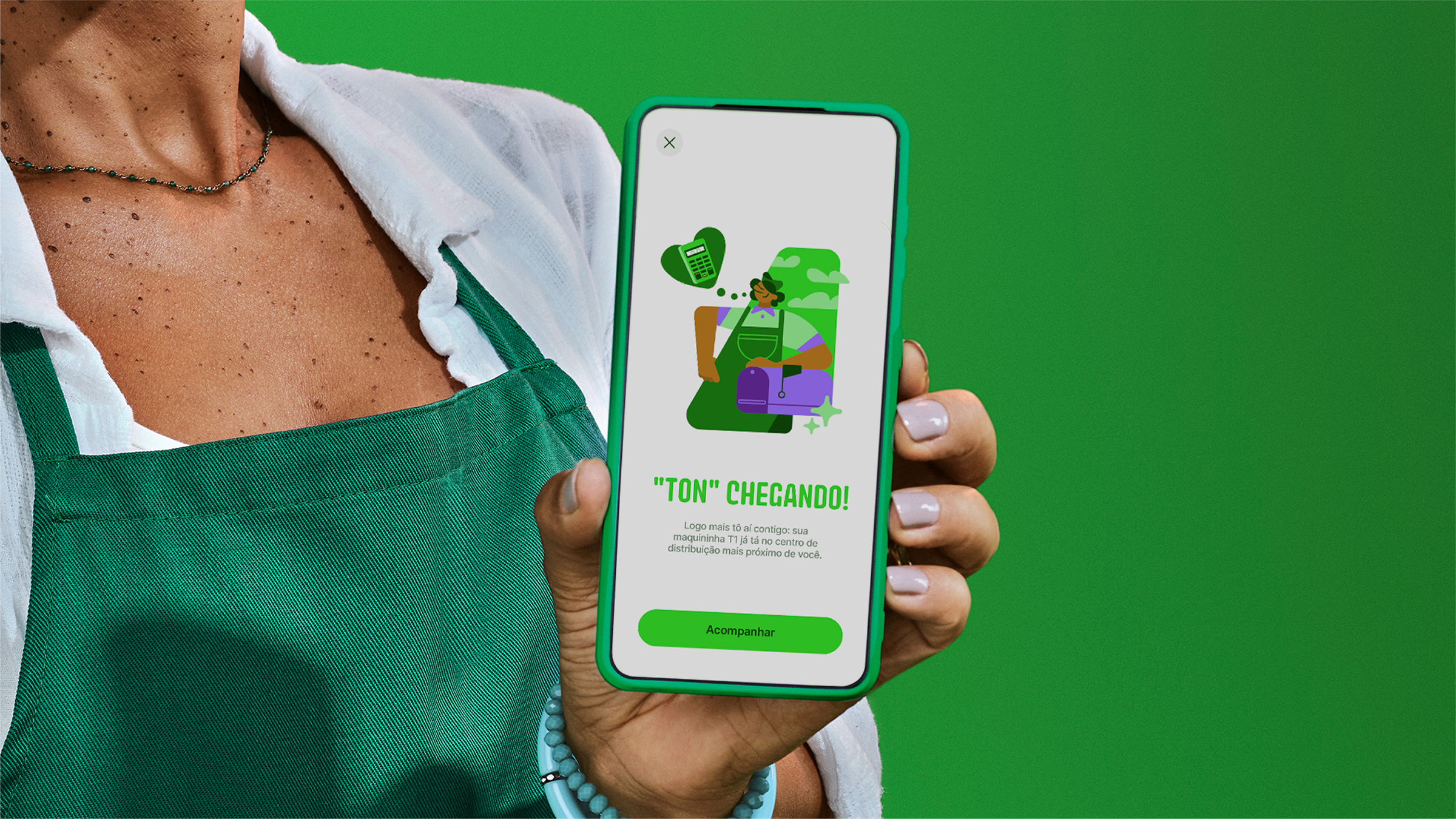
What used to be just a “little face” in the logo then became a living character, who expresses many moods and adapts to talk to the customer on an equal basis! Based on this strategy, a motion-first visual identity was created, which translates Ton's moods in the various brand touchpoints in a consistent and fun way – and prepares the brand for its future as the AI that is always on the side of the Brazilian self-employed professional.

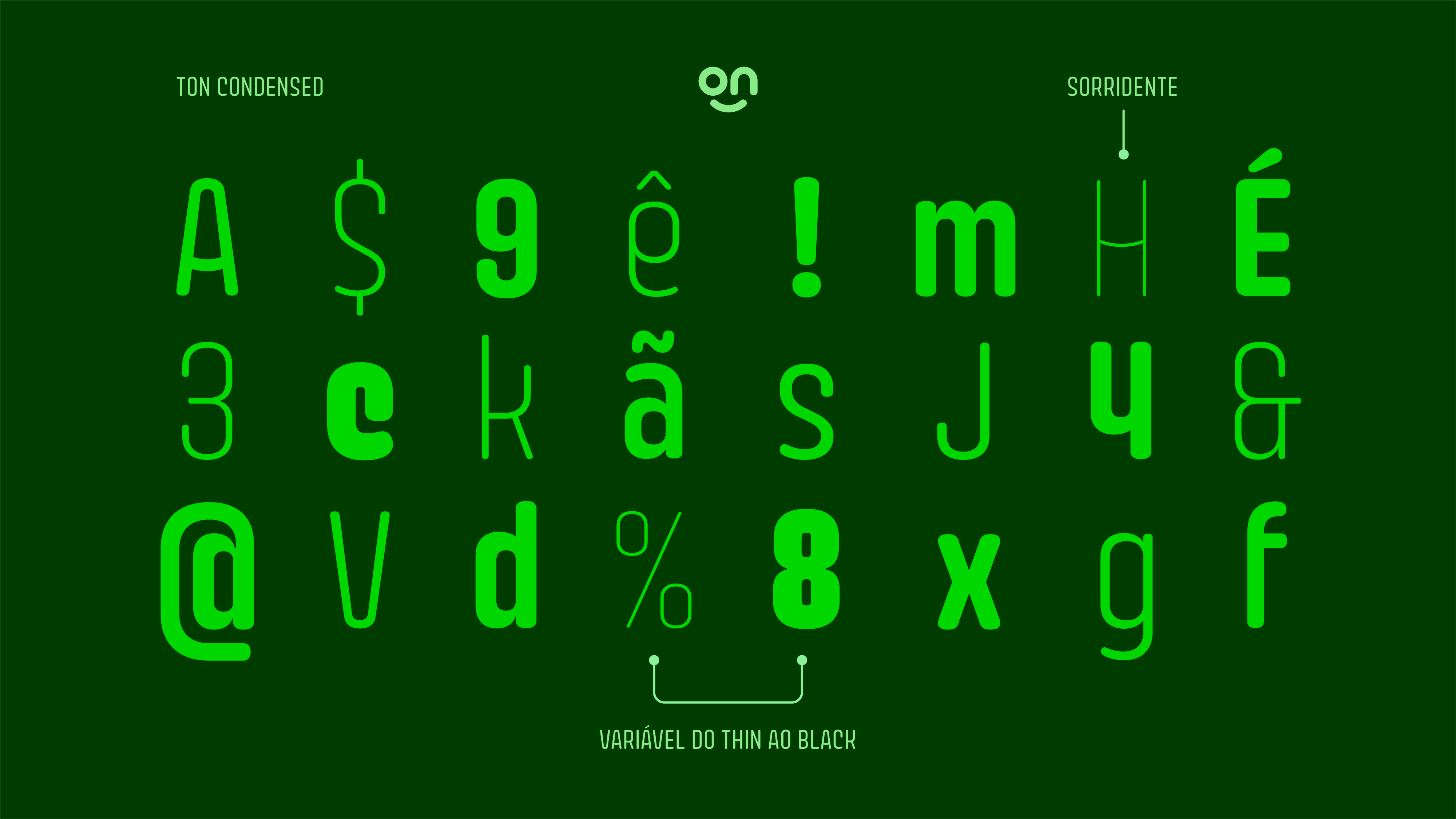
Ton Condensed is a custom Rounded typeface for titles. Inspired by the design of the logo, it has rounded ends and “smiling” details (as you can see more clearly in the bars of the letters A and H).
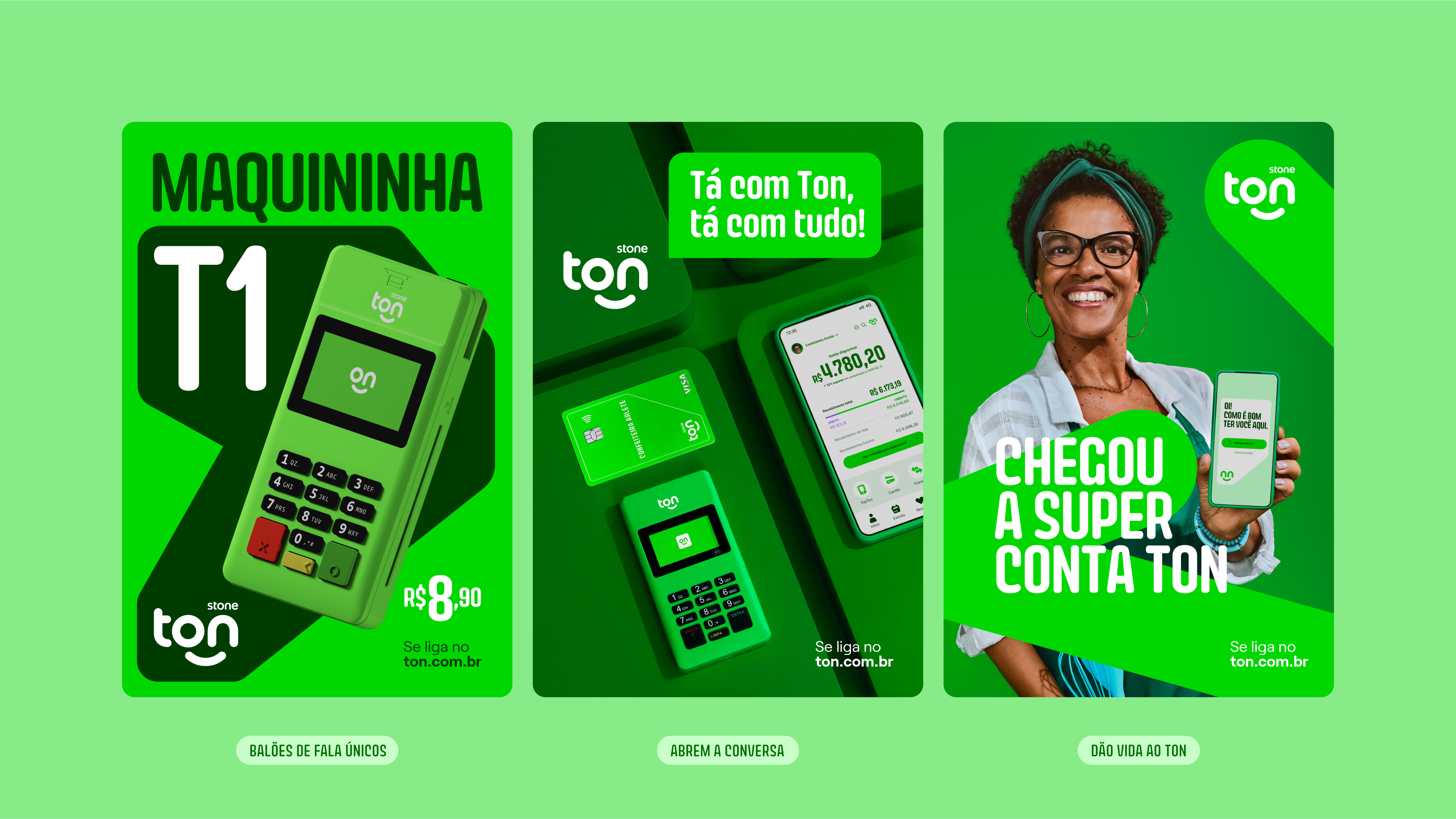
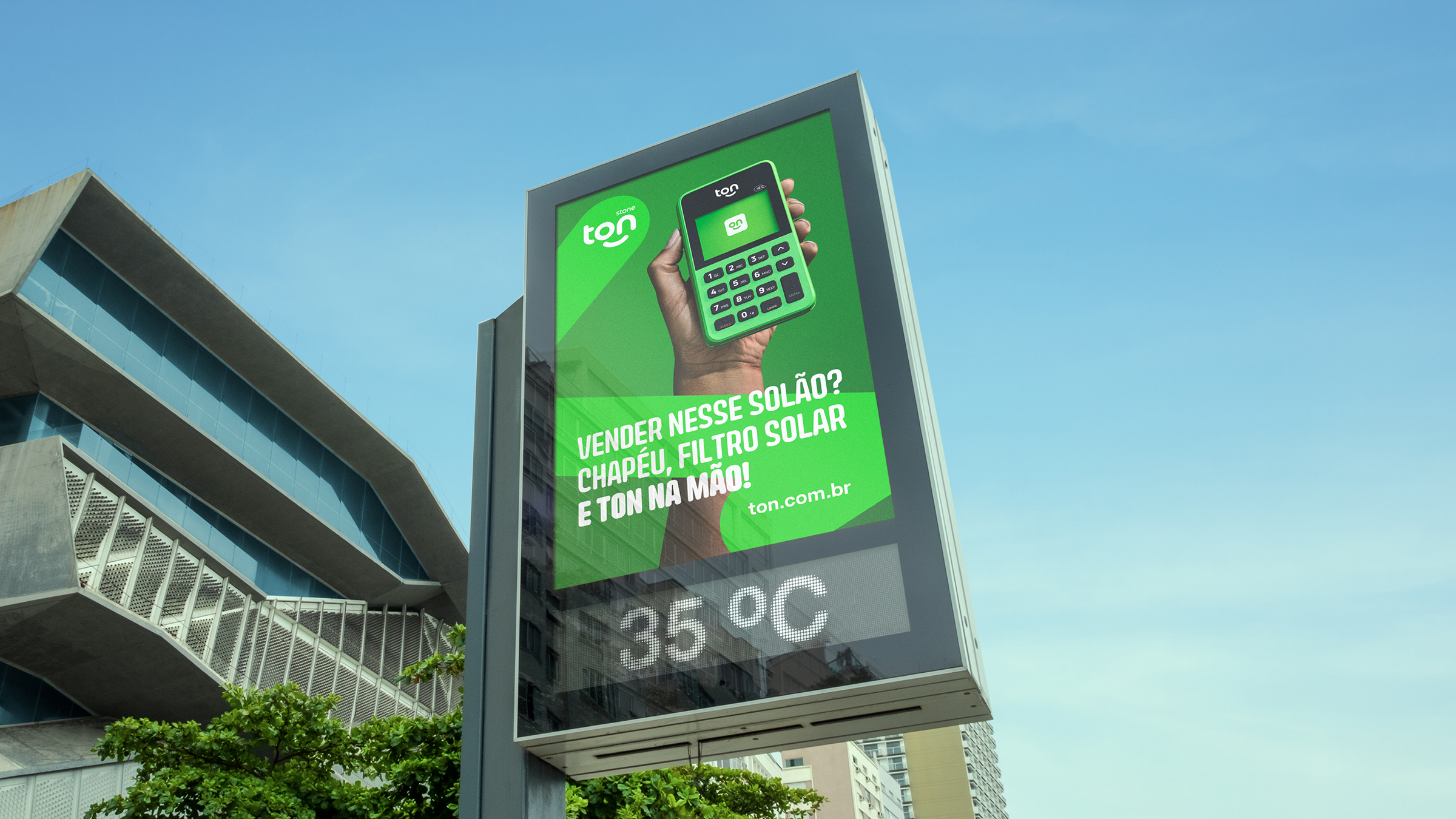
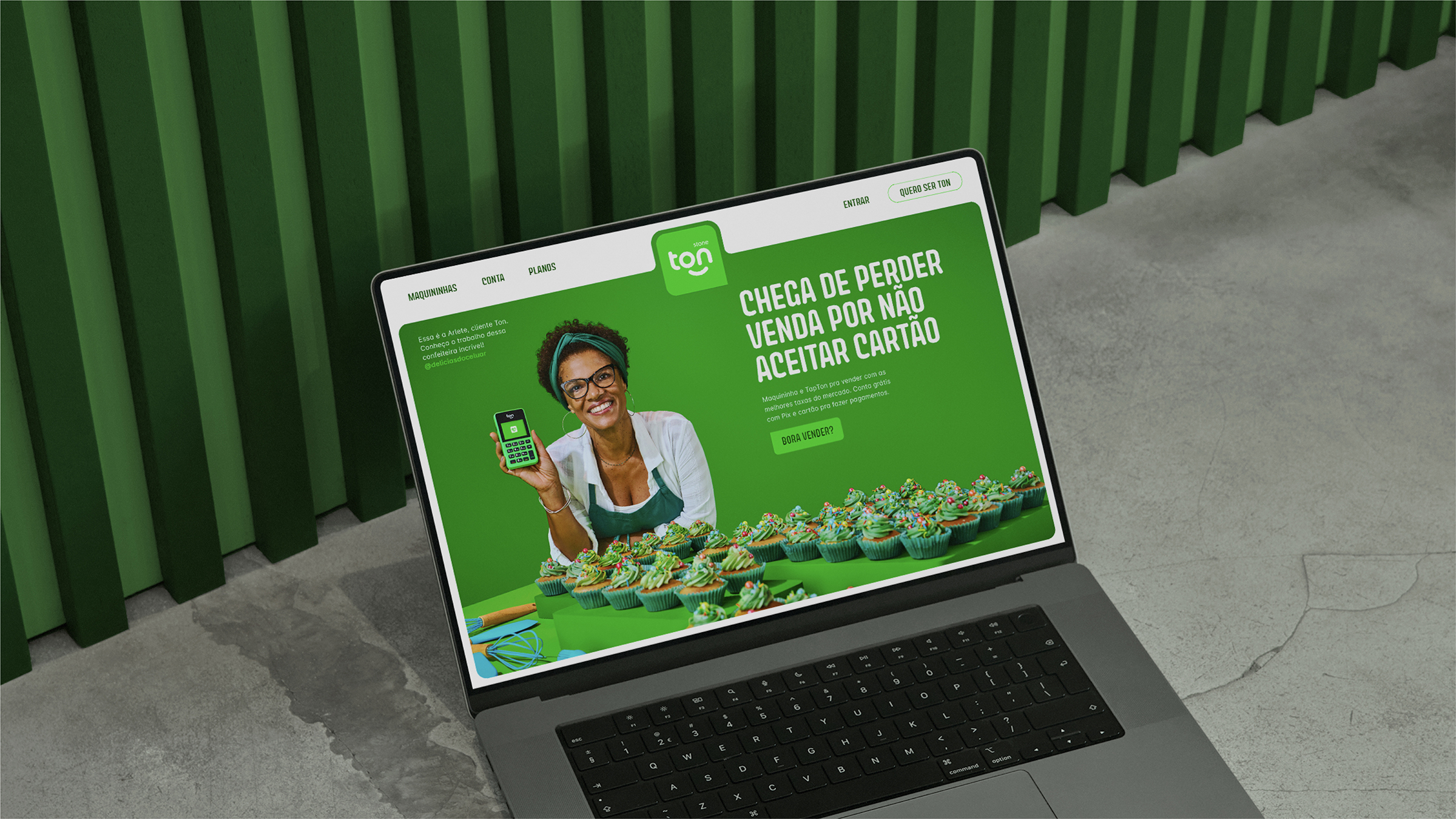
When we started thinking about Ton's tone of voice, in its movement to express itself as a character and a friend of the client, the answer was obvious: to build a first-person tone of voice, as if talking to the client on an equal basis, face to face, in a conversation between “me” and “you”.
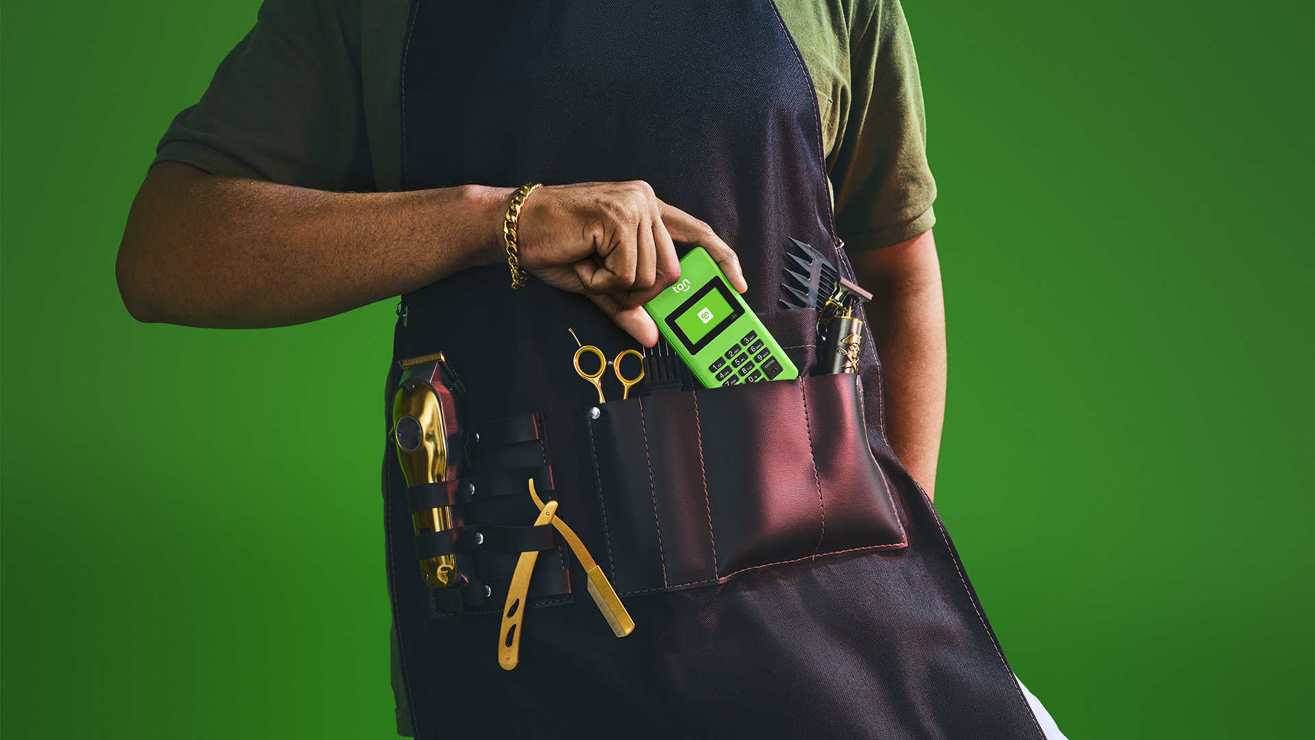
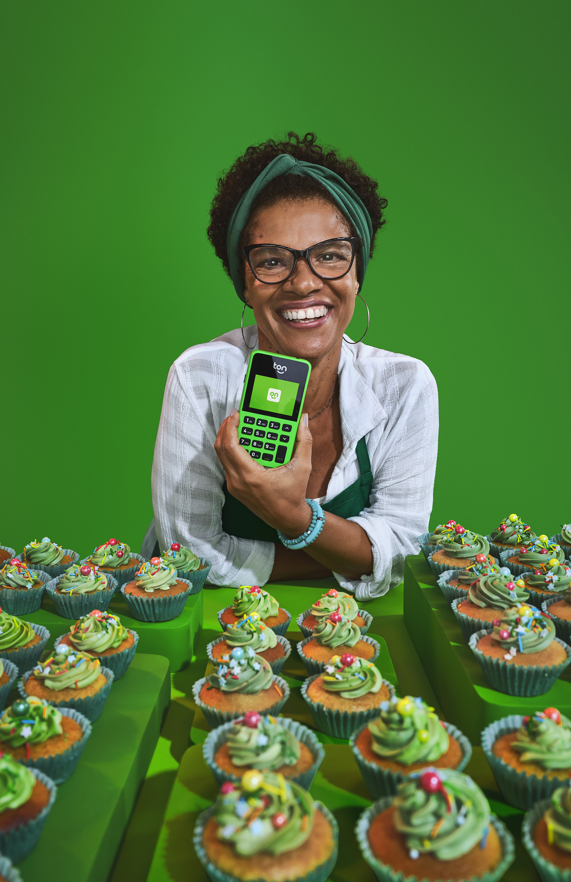
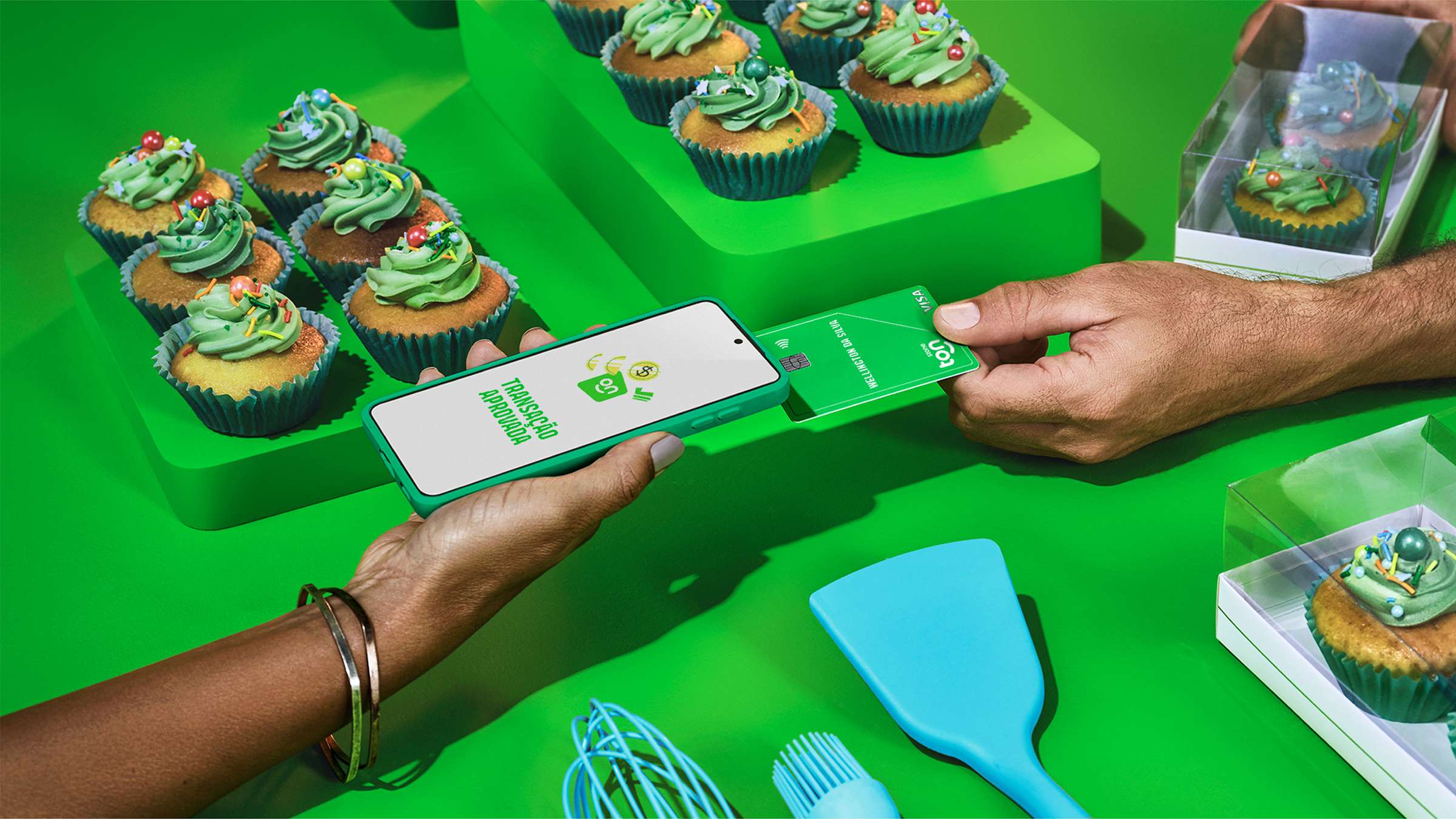
More than building a photographic style around real customers, the photographs make it possible to create communications focused on promoting the businesses driven by each micro-entrepreneur, whose names are also highlighted: the barber Joebe; the dentist Ana; and the baker Arlete (she made these delicious cupcakes!).